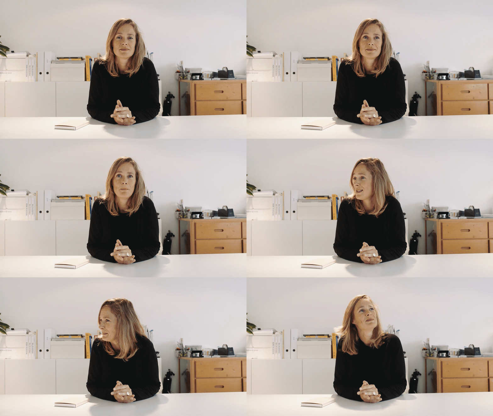
A conversation about making diaries, with Marjolein Delhaas
Tell me about your path to what you’re doing now?
For my graduation project, at art academy St. Joost, I indexed all my belongings. Ordered everything on type, color, size, brand, etc. With that data I made a square typographic catalog, of my life. During the process of indexing my life the idea came up to additionally make a diary. A diary that was already filled in. Only the initial project took me so much time that I kept this idea as a future project.
After the academy I got a job at design agency Stout/Kramer. Where I already did my internship and worked during my graduation. I worked there for almost four years. I wanted to start my own studio, but Remco van Bladel (good friend and former classmate) asked me to come and join him at Solar Initiative. I stayed there for two years. That was around 2005–7.
When I started my studio, in 2006, I only got requests for designing corporate identities. As I was skilled and experienced in making books I never understood where those requests came from. Creating identities is a totally different design process. Not something I thought of as my best quality as graphic designer. I learned, and got better at it. And although I really like making corporate identities the wish to make books stayed.
At the end of 2008, two weeks before the new year began I made the first planner. The process to the first planner was slow. At St. Joost everybody was always binding books, so my interest started there. During the period at Stout/Kramer I was more and more binding small notebooks. For my own use, to do research, to see what is possible. Try different bindings techniques, using different material combinations, for the cover, and inside. The first collection I printed myself on my laser printer, I bound them all by hand and made all covers myself. The first three years were like this. I let it grow very naturally, didn’t want to make a big investment straight away. It had to earn itself back. That’s really how it started. Just experimenting. Like some kind of playground.
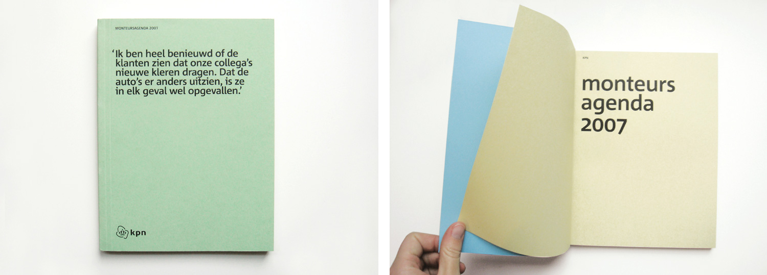
In 2007 at Solar Initiative you won a Red Dot Award for the KPN technician's planner.
Yes, that's true. I forgot about that. When I designed it, the agency initially didn’t agree with the design and the suggested material. That is the most funniest thing about it. I basically run the project by myself.
The planner was for the KPN technicians who work outside all day. The idea was to make a planner with paper that quickly aged, paper that reminded a bit of the old technical manuals. In the middle a big foldout. With photo’s of the technicians in new KPN uniforms that they wanted to introduce with this agenda. I remember that the creative director representing the project, said “I can’t present this design to KPN, it needs to be glossy, shinny.” I said “I don’t agree because the diary is for the technician’s and thus it should be more rough, a workmate, something they can relate to.” Anyway, it was presented together with some glossy corporate variations. I was not asked to join, but KPN loved the idea of the uncoated paper. We made 3 different cover versions. I remember that not one of the creative directors looked closely at it when it arrived from the printer. They seemed not interested. They did send it in for the Red Dot Award, though. And once they won, all names where – of course – under it, although it was the first time that they took a close look at it. Winning this award motivated me to stay persistent in what I believed was right.
Was creativity part of your childhood? Were your parents active in creative fields?
Creativity was a huge part of my childhood. My parents always say: “You were so young and you already made these small things from paper. Little forks, knives and plates as part of a caravan you made out of a cardbox.” When someone asked my mom if she knew what present to give for my birthday, she always said: “Give her scissors and some magazines and she is happy”. For as long as I can remember I have been busy with paper. I made my first custom agenda when I was seven or eight. A 5 by 8 cm small booklet with Snoopy on the cover.
If my father had the option to study, he definitely would have chosen a creative profession. He always says he would have become an architect. My mom also is, not professionally, very creative. Making clothes, dolls and being the handy man in the house after my dad divorced her. They both have the most inventive ideas, and certainly inspired me to always try and do things myself.
What does a typical day look like for you, if there is one?
I don’t have one, every day is different. Well, I always come in and make coffee, make another coffee (and another, if I'm very busy). Then sit down and start working till it is time to go home. I am good in forgetting to eat lunch, I’m very bad in taking time off for this, as I get fixated, absorbed, in what I am doing. Luckily I have good neighbors! Like Lof der Zoetheid, who supply me with the best fresh soups or sandwiches. Basically I start and don’t give up till it is time to pick up the kids. Good thing they are part of my life now, as otherwise I probably keep working. My days are very divers and never dull. One day I am only responding to emails, the other day I am only making new designs. Some days it is a mix of all the tasks that need to be done.
How important is a diary for you?
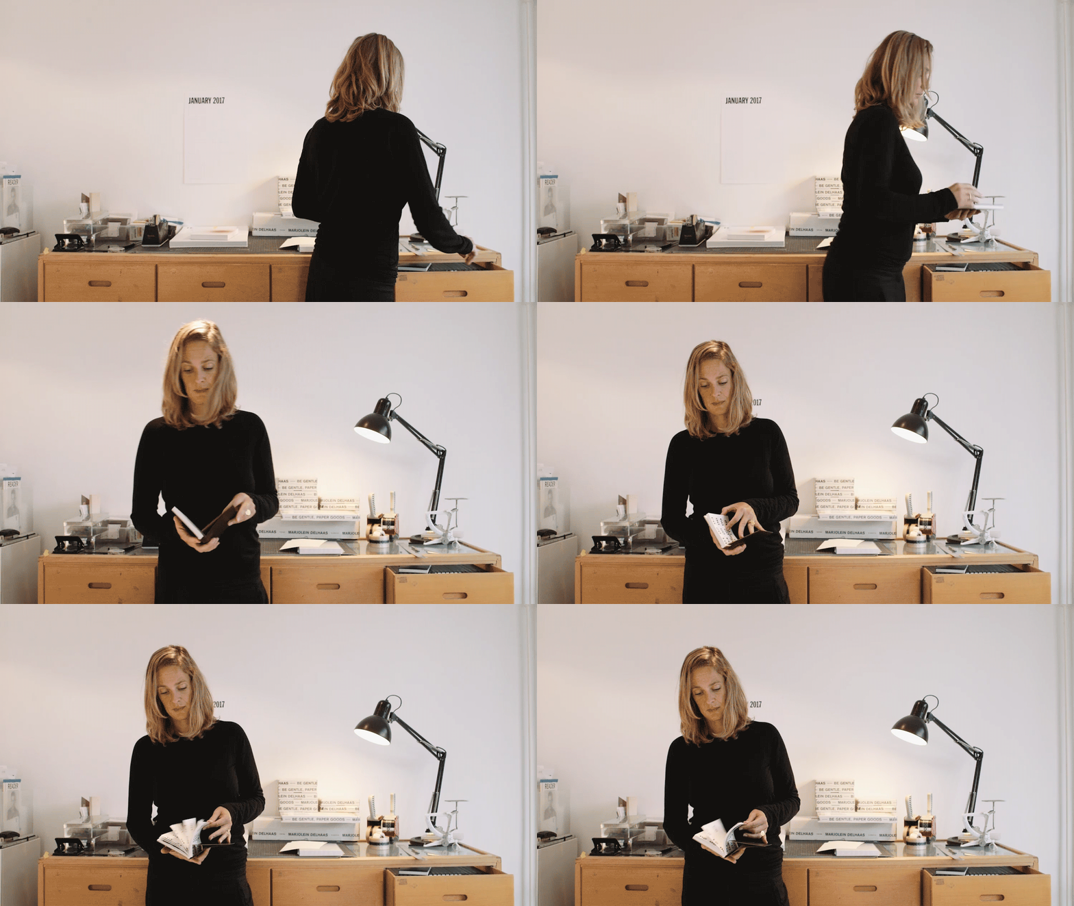
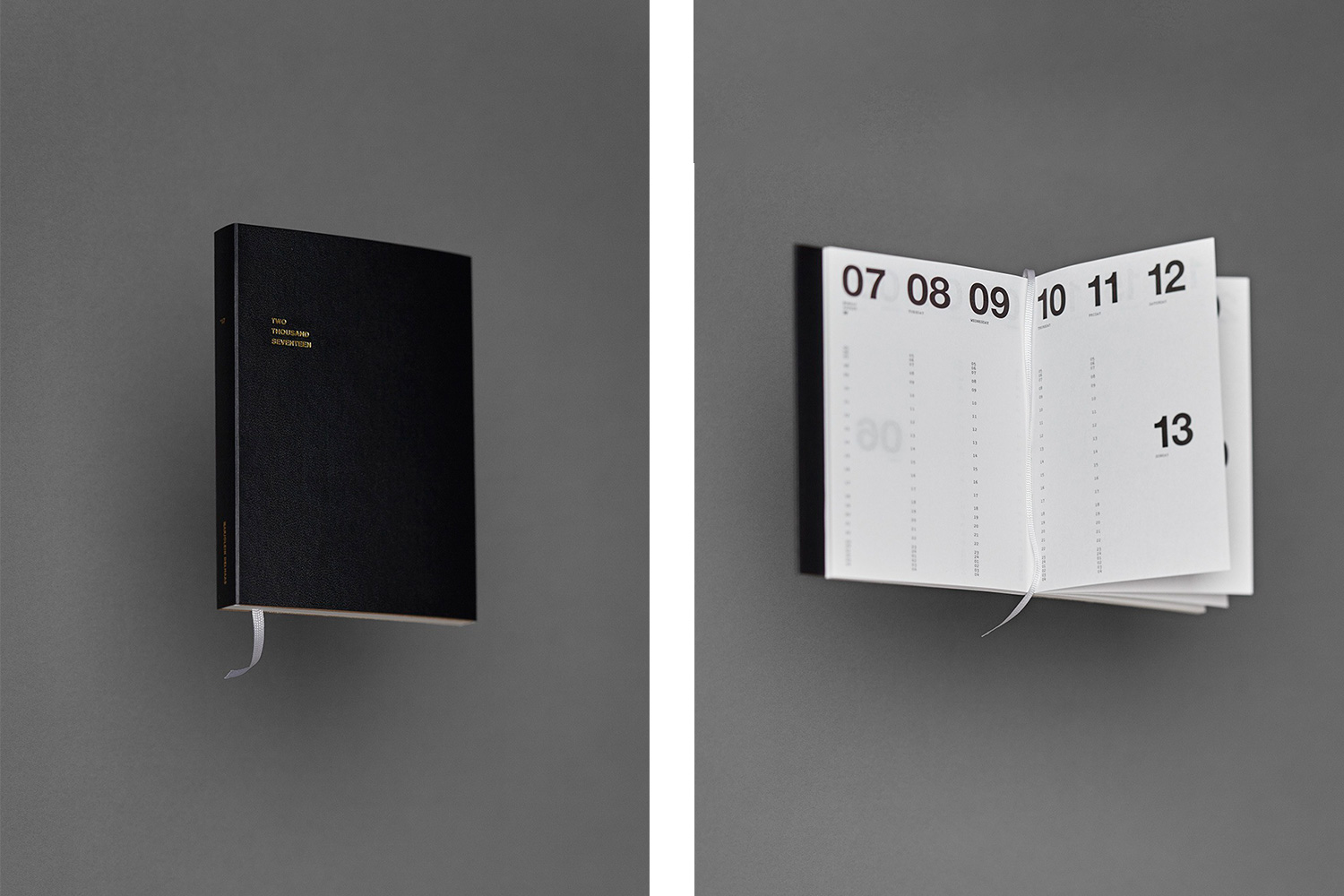
It is important for me. This year I don’t use it as frequent as I did before, because I am using my new Tear off Desk Pad planner. Perfect for the office. But then again I feel sorry. I feel that I have to write it all into my diary as I tear off the pages of the block, while the diary I keep. Using a diary helps me, it is a small personal assistant it keeps me clear in the head.
When I started making diaries, lots of people asked me “Why a diary? You have your smartphone, your iCal… Are there still people using a paper agenda?”
For me somehow digital planning is not that organized as people think it is. Because the data somehow gets lost in files and folders. Lots of people still relying on paper agendas. It is very personal. In a digital calendar you can not make small notes or a sketch. I can not use a digital calendar as I would like to. A piece of paper gives so much more freedom, to make it yours.
The folder in the cover of the Classic Planner I added for this reason. To store small found treasures. When I go somewhere and I see a nice card I have a place to store it and keep it with me. I see the books as small archives of my life. That's why the size is so convenient you can put it in your bag and take it with you.
I try to combine the two tools, the things I really cannot forget I put as a reminder in the digital calendar, because of the alarm function. But I also use my paper planner. It is not only for planning the future but it is also about noting what you did. A bit like a retrospective. Looking back. A couple of words is sometimes enough to remember it all.
At home we use the Wall Planner. It is handy to get a quick monthly overview. For planning weekly in the office, as said, I created the Tear off Desk Pad last year. This year I made small edits. Erased the dates and replaced them with days of the week. That gives more freedom to use it. For one project I plan a couple of weeks, hang them after each other on the wall. Give it the name of the project and go. That's how the desk pad has evolved. For me it is very important to make these minor changes. To improve.
I like to plan from top down. For me that is a very logical thing. People frequently ask me why I don’t make the layout horizontal, but that doesn’t work for me. How to differentiate the things that you plan in the morning, afternoon or evening? Planning verticality feels natural, starting at the top, and work your way down the page.
I’m not like a crazy lister, but I think it clears my mind to write things down. Making a list of what I need to do. Just to keep my head ordered. There is enough in my head already, so everything I can put down gives me structure and I like that. I might seem very organized but my other me is very chaotic, hahaha.
Do you have any favorite diaries/books that have been particularly inspiring or encouraging to you?
I was already making small booklets, based on those A6 hardcover dummies we used at the academy, when I saw Moleskine. The first big company making notebooks and diaries at that time that were attractive and well accessible. For me that was not inspiring, but it was encouraging! Deep down I had this silent wish to create beautiful, functional and typographic paper goods. I knew there’d be a market for this. And there it was in front of me. Someone was doing it, although different from how I would do it. Then the realization came, if I want to do something with it, I have to work on it, now!
Moleskine, inspired me in trying to make something totally different. When I saw that they, like me, had this file folder in their products, I thought of a way to keep it but in a different form. I used the idea of the catalogue I made in my graduation year. That had a file folder in the cover inspired on the elpee cover. The same goes for layout, size and so on. Some of the design decisions are tested in earlier projects, from before 2002. All answering to personal preferences or needs.
Materiality/tactility is important to you, how do you select the paper/material for your products?
I am very picky, not only when it comes to paper, but even to which pen I use writing on that paper. I hate ballpoints. I can not write with them. I have only two pen brands I use, and that also goes for paper on which I want to sketch or write. It needs to work and give the best result.
As the preferred paper, Munken, is not suitable for laser printing. The first editions were printed on Biotop paper. But once offset production was an option I switched to Munken immediately. The Biotop was too smooth and yellow. Munken has more roughness.
For me paper needs to feel as paper, but it also needs to write or draw very well. When paper comes back from the printer the paper always feels different. That is something that I have to take in counter when choosing the right paper. The choice of paper and production techniques are as important as the choices made for type, layout and colour. You do not only design the artwork, but also the item itself.
Everything needs to feel perfect. It took me so many years to get it right and I am still not satisfied.
Every year I make small changes, but not much. For example, the weeks went from the middle on the right side to the top of the left side and I got rid of the word ‘week’. Also I capitalized the days. The handmade covers of the Classic diaries changed a bit because I had means to outsource them to a hand bookbinder. As making over 400 covers by hand myself started to be too impossible. Finally I could replace the paper label with a foil stamp. Making it really as I envisioned it from the start. That is the positive and fun side of growing. To be able to focus on these small things that improve usage and/or quality of the product.
Oh, one more important change: I put my name on it. In the beginning it felt awkward to have my name on the cover. But seeing it grow, I realised how important is was.
The Basic planner still is my playground. It gives me the opportunity every year to go a bit with, what I normally don’t do, trends. Or try different/new techniques. Changing cover material every year and even use different covers for the same collection. I like to find the right paper combinations. Searching for that little bit of rawness in it, contrast, so it does not get too perfect. The design is already very clean it needs a raw edge.
Searching for new papers and techniques give new ideas for the other projects I work on. I now have two projects in which I use a similar technique I used for the 2016 edition. Another client wanted a bag inspired on the 2015 edition. They saw it on the planner and the said: ‘wow I want this!’.
When the design is minimal, does that make material and the tactility of the product more important?
Well, I don’t know if it has to do with minimal design. Minimal design is a way of building your layout. Bringing in the things you need, and drop the things you don’t need, is much harder than bringing things in, by the way. But I love minimal design, it attracts me.
I agree, when you work with minimal elements and have a lot of white/negative space the material you use is much more visible and so more important. But in my opinion the same goes for a bold, illustrative design. It is all about quality.
When designing I always question if it is usable and attractive. Lots of designers say that it only needs to be functional, I disagree. Beauty attracts the eye, somehow. You can like it or you don’t.
Outstanding material is as much part of the design as choosing the type or colour, and thus extremely important. If I would print my design on regular white copy paper the experience would be totally different then when i would use a paper with a particular surface or teint. It makes the difference of how you experience the design. It is not only about how it looks but also about how it feels. But maybe copy paper is the best solution for your design. It totally depends on the idea and what you want to achieve with it.
When you start thinking of a new collection do you have a program for it?
I never had a big plan for the collection. I call it collection now but it started slowly. It evolved very slowly to where it is today. I always saw it as a side project, so I never had a schedule for it. But now it starts to be more and more serious… and it definitely needs tight scheduling now.
The new collection needs to be visible in the beginning of the year previous to it, so shops have time to order before production. Mock-ups need to be finished, and with that the design of the complete collection. I can still tweak some of the elements but I need to be sure of the big line by spring.
So slowly it starts to feel like of a fashion collection. Officially I am starting in January to design for 2018, but already now I am collecting ideas.
Also it is not only the design I need to take care of. Production, client administration, financial administration, contact with customers, shops, photography, promotion, the online store, social media, and so on… So this year I had an assistant, we made a month by month planning. The schedule included everything, from design to promotion. I needed something to refer to, to remind me, as I also work on several other projects at the same time.
What are the biggest risks you’ve taken to build your business?
I try to keep my risks as minimal as possible. The diary has to earn itself back. Always. That was something I set for myself as a goal when I started. I do invest, but I should directly earn that investment back, otherwise I stop.
The diaries were a side project. It started as and still is my playground. Now the project is at a point where it generates an income. But more important it is a great platform for my graphic design work. This year I worked on two really big and exciting projects based upon my diary designs and my social media presence.
So what's next?
I don’t know yet, what I like is that it is spreading my name and work, and I get amazing projects because of this!
There are many ideas, always. Collaborations, or maybe one day turning my studio into a shop, or not. I don’t know. Yet. It is nice to dream. I like taking it step by step, try to stay focussed and not go too fast. I don’t believe in going fast. I am most of all enjoying what this ‘side’ project has brought me. It is really cool to get projects that you always have wanted to do, making commissioned books and calendars for really cool clients.
You find Marjolein Delhaas on marjoleindelhaas.com, Instagram and Facebook.
Interview: Thomas Dahm
Art Direction: Dirk van de Heuvel / Thomas Dahm
Animated gifs: Gilles van Leeuwen
Photos collection Marjolein Delhaas: Ingmar Swalue
📬
Get the latest design conference news
in your inbox!
Join over 2,000 readers and receive a curated mix of upcoming events, inspirational talks, and links at the intersection of tech, design, and culture every Monday.