Documenting a Design Conference
Last week I went to Element Talks on invitation by the organization and the Adam Mickiewicz Institute. For three days I enjoyed the beautiful city of Warsaw and the sixth edition of the design conference.
The days before my trip I started to think about what would be the best way to document the conference and all the meetings that were planned. On previous conference trips I used Apple Notes to document my experience or to prepare my podcast recordings. Because in a single note, you can have text, images and sketches. Before Notes, I tried writing everything down in my notebook, but then I found myself constantly switching between writing, searching for a pencil and grabbing my phone to take a pic from the big-screen or record a short clip. This I found was too much of a hassle and it distracted me from listening to a presentation.
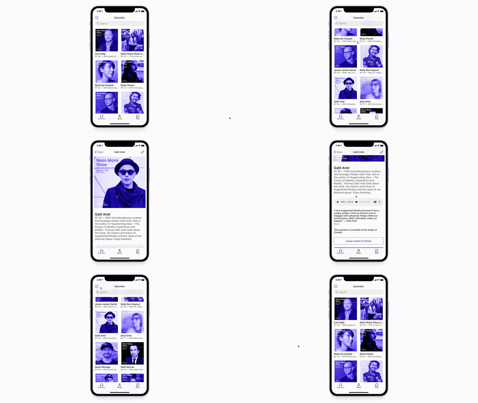
The past months I have been experimenting with making 'no-code' apps using Glide. Glide is a platform that enables you to build a mobile app without using any code, based upon Google Sheets. Examples are the Neon Moiré Show Podcast App and the Design Summer School App, based upon the article that I wrote, earlier this year.


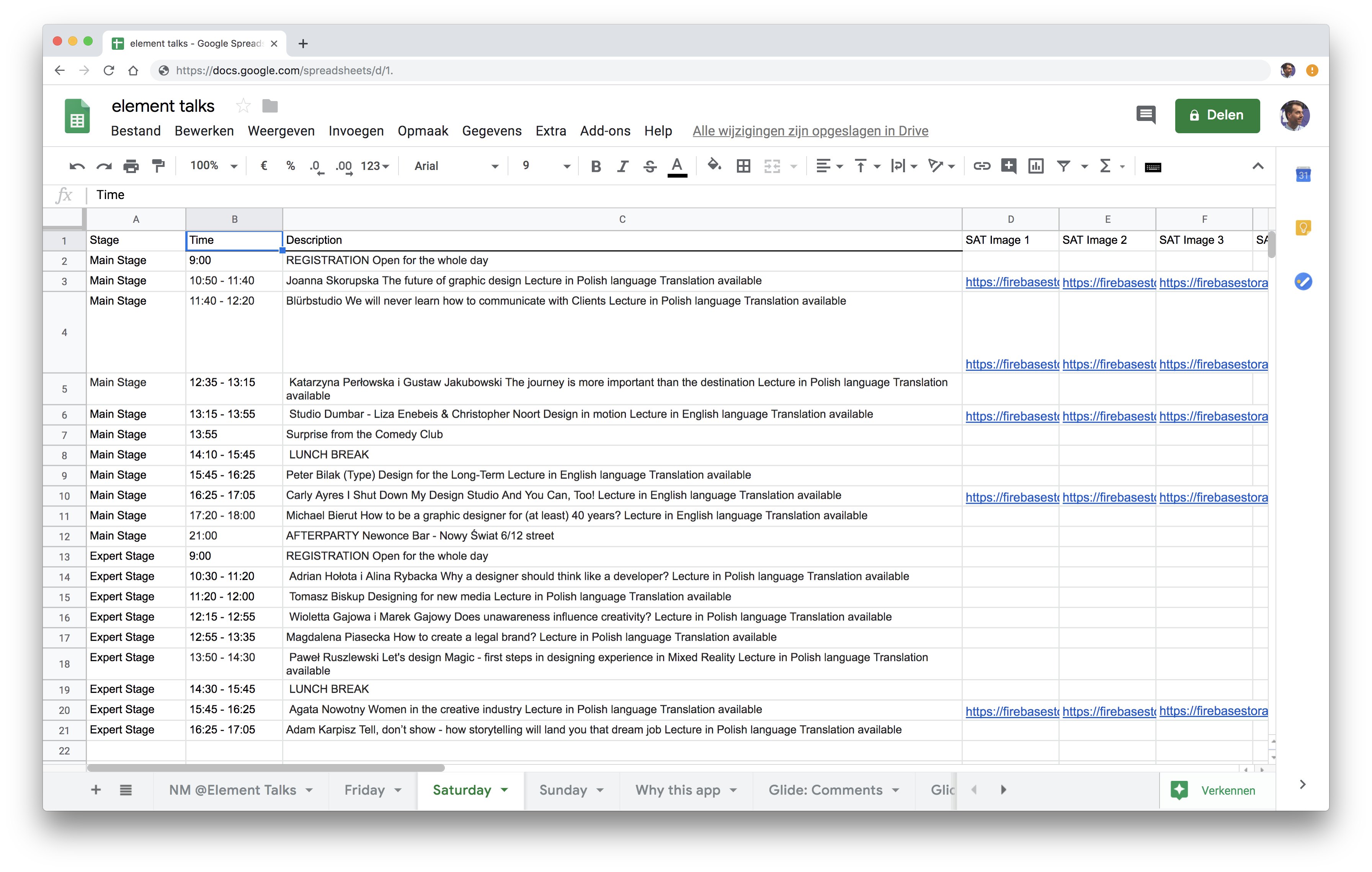
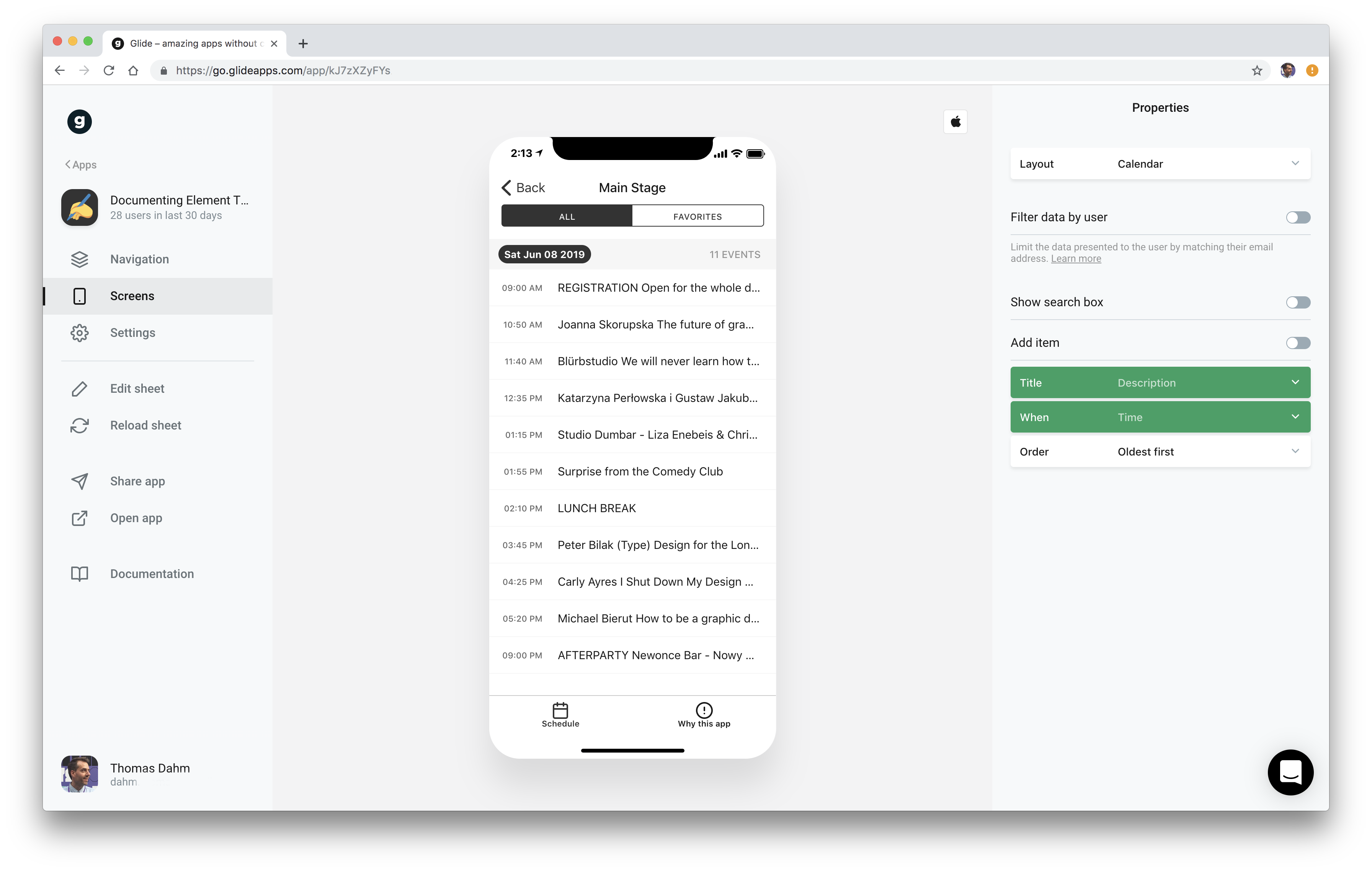
On the evening before my conference weekend I started creating a sheet with the full program, which I scraped from the event website (sorry, guys!) and optimized it for Glides calendar view.
Underneath the day schedule I added a little survey. With open questions, like 'Highlight of the day?', 'Inside of the day?' and 'Who did you meet today?' All with the intention to help me better remember the mood of the day and my general impressions. I added a different survey to all program items. It included some questions, the notes and favorite option plus I added Glides photo picker to add max five photos.
So far so good.


Making an app to document your trip also means that you have to use it. During the days I noticed that I used the app mainly to check the schedule. I found it hard to answer the questions that I added on beforehand. Now I asked myself if that is because I favorited some lectures that I really wanted to see? Or was it because I had to prepare my podcast recordings? Or were my own questions not compelling enough to answer!? I guess this needs some more testing.
In general, making the app was definitely useful to understand if documenting a design conference through small surveys would work. Looking at self-tracking apps like Reporter, Exist or all the templates on Notion, it was a kind of no brainer that it would work. But as with everything you have to do it and keep on doing it, to know if it works.
Conclusion
Glide is extremely user friendly to use. With the programming power of Google Sheets and app connector Zapier you can build almost anything. Glide's note, image picker, favorite, and calendar functions where essential for this case. Uploading photos to their servers can takes some time even on a WiFi network. During the conference I shared the app with several people, so they could test it as well. They were impressed by the out-of-the-box easy install, speed, calendar view and the general design of the app.
Would I make / re-use the sheet to document another conference? Yes, because it’s easy to have all the information in a one personalized app during the event. Although some events provide apps, with more or less the same functions and it takes some time to make and customize a new setup. For now I prefer to have my own app, so I'm the owner of the data. Plus it’s really handy to have all the information in one sheet when writing an article or review, for copy and pasting your thoughts.
Read the review, We went to Element Talks and learned that portfolios aren’t dead, which I wrote with the help of the app.
📬
Get the latest design conference news
in your inbox!
Join over 2,000 readers and receive a curated mix of upcoming events, inspirational talks, and links at the intersection of tech, design, and culture every Monday.